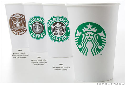
 Starbucks, celebrating its 40th anniversary this year, unveiled a new logo Wednesday that brings the iconic green siren out of the circle and drops the words 'Starbucks Coffee.'
NEW YORK (CNNMoney) -- Starbucks Corp. debuted a logo Wednesday that brings the iconic green Siren out of the circle and drops the words "Starbucks Coffee."
Just a few hours later, the backlash against the change started building on both Starbucks' website and other social media platforms such as Facebook.
"Was the Starbucks corporate office asleep through all of the Gap controversy when they tried changing their logo? Leave it alone! There's nothing wrong with it," a fan wrote on Starbucks' Facebook page on Wednesday.
Starbucks: Turn used cups into new cups
The Seattle-based coffee chain, commemorating its 40th anniversary this year, said the logo change marks the company's milestone year and Starbucks' (
SBUX,
Fortune 500) next chapter "in our history."
"Throughout the last four decades, the Siren has been there through it all," Howard Shultz, Starbucks' president and CEO, said in a post on the company's website Wednesday.
"Now, we've given her a small but meaningful update to ensure that the Starbucks brand continues to embrace our heritage and also ensure we remain relevant and poised for future growth," he said.
The new logo will rollout beginning in March.
Shultz hinted that Starbucks' patrons can expect more "evolution starting this Spring" but didn't offer any details.
The announcement already received more than 100 reader responses on Starbucks' website.
A quick scan of the reactions showed consumers were mixed about the refurbished logo, with many people unpleasantly surprised by the changes.
"Who's the bonehead in your marketing department that removed the world-famous name of Starbucks Coffee from your new logo? This gold card user isn't impressed," wrote MimiKatz.
"I prefer the old logo," another wrote. "I've been a Starbucks fan since I lived in Portland in the late 80's and I've been in Mississippi for the past 11 years enjoying Starbucks. I'm all for change...I think it's great, but I'm not impressed with the new logo."
And gerberfranz wrote: "Removing the Starbucks name off your logo does not make any sense. I have been a big supporter of Starbucks since the early days, taken expensive rides in taxis to get my morning coffee, even waded through two feet of snow in my business suit. I do not see the logic of your business development folks. Free advertisement on every cup, every day. Think about it."
But a few people supported the move.
"Wow... What a beautiful and compelling way to move the company into the new millennium. I always thought that the harsh black band around the siren represented the shackles of history past," wrote cjsvendsen.
Another Facebook user wrote, "Love the new logo. Streamlined, modern, simple, elegant. Change is obviously more difficult for some than others..."
"Logo changes do get a lot of attention and we were expecting a lot of discussion about this change," said Starbucks' spokeswoman Deb Trevino. Regarding the backlash, Trevino said the company expects customers comments to even out over time.
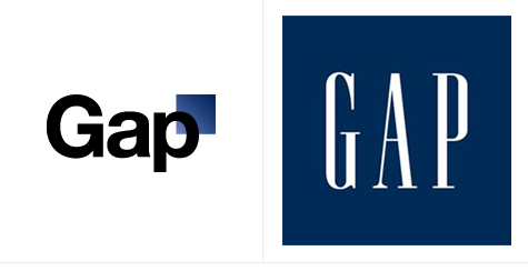
Starbucks' logo change is reminiscent of a similar move made last year by No. 1 clothing chain Gap Inc (
GPS,
Fortune 500).
In early October, Gap
shocked its fans by changing its iconic blue-box logo encasing the word "GAP," changing it instead to a small box placed above the word Gap.
The move spawned such fan fury that Gap quickly backpedaled on its marketing misstep and reverted to its old logo a week later.
It remains to be seen if its latest logo facelift causes an uproar and how Starbucks deals with the aftermath.
Trevino said Starbucks is absolutely committed to the new logo. "We made the change to support our strategic and business decisions," she said.

 "We want our customers to take notice of Gap and see what it stands for today," she said. "We chose this design as it's more contemporary and current. It honors our heritage through the blue box while still taking it forward."